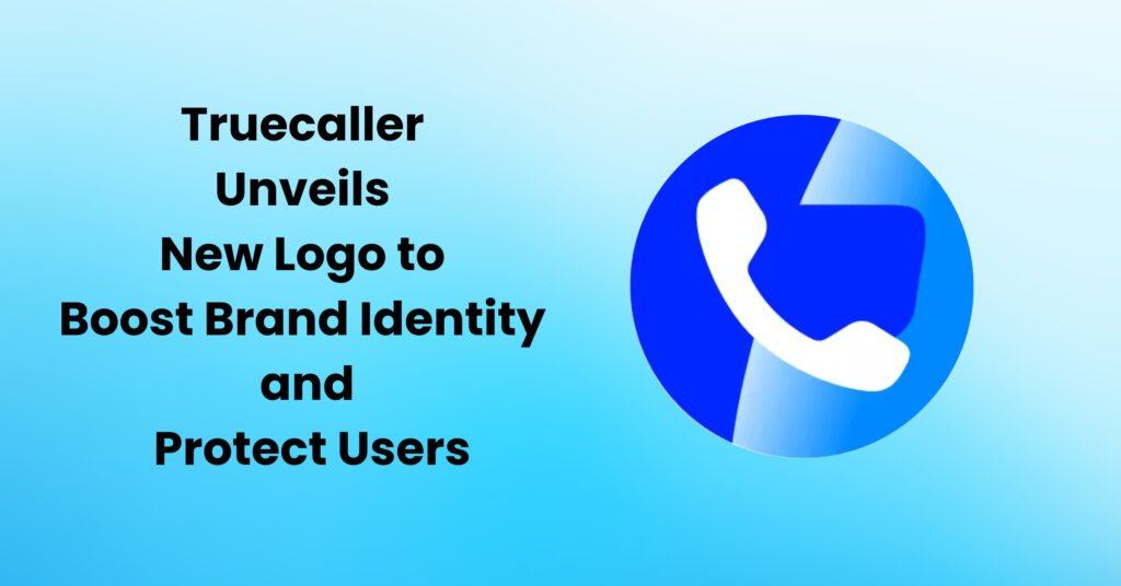
Truecaller, renowned for its caller identification and spam filtering capabilities, has introduced a fresh logo to cement its unique identity in the app ecosystem. This redesign emerged in response to concerns over its previous logo’s resemblance to icons from giants like Google and WhatsApp. The revamp aims not only to eliminate any potential confusion among users but also to fortify its stance against imposter apps. The new design retains Truecaller’s essence while ensuring clearer differentiation, reaffirming the brand’s commitment to user-centricity and security.
In a recent blog post, Truecaller’s CEO, Alan Mamedi, shed light on the rationale behind the logo transformation. He pointed out that with time, the previous logo had begun to appear outdated. Moreover, its resemblance to logos of other major apps was causing mix-ups. This dual challenge of staying current and ensuring distinctiveness prompted the company’s decision for a design overhaul. Mamedi emphasized the brand’s dedication to continuous improvement and its aim to stay relevant, while also maintaining a clear and distinctive identity in a cluttered digital landscape.
Truecaller’s CEO, Alan Mamedi, candidly addressed the motivations behind the logo change in a recent post. Highlighting the evolving nature of digital aesthetics, he noted, “Our old logo was starting to show its age,” implying that it no longer reflected the dynamic and forward-thinking essence of the brand. More concerning was the logo’s likeness to others, presenting potential pitfalls for users who might inadvertently download incorrect apps. In this digital age, where app icons are the immediate touchpoints for users, such confusion can have repercussions. Mamedi shared the company’s aspirations for the redesigned emblem, stating, “With our new logo, we aimed to sculpt an image that stands out — one that’s both distinctive and leaves a lasting impression on our users.” This move underscores Truecaller’s commitment to user-centricity and brand evolution.
Alan Mamedi emphasized that the revamped Truecaller logo is more than just a fresh design; it symbolizes the brand’s unwavering commitment to innovation. Furthermore, its modern look encapsulates the company’s dedication to safeguarding its users, reinforcing its position as a trusted ally in the ever-evolving digital communication landscape.
In a recent statement, Truecaller’s CEO, Alan Mamedi, highlighted the brand’s relentless drive, saying, “We are constantly innovating and adding new features to Truecaller.” This commitment extends beyond just providing new functionalities; it encompasses the brand’s dedication to user safety by shielding them from spam and fraudulent activities. Mamedi stressed that the newly unveiled logo embodies these core principles. He articulated that the modernized emblem serves as a visual testament to Truecaller’s values and its forward-looking vision, merging both innovation and security in a symbol that speaks to the brand’s evolving journey in the digital realm.
Truecaller’s revamped logo is currently being introduced to its user base. This refreshed design will be prominently featured within the app, on the official website, and across all marketing materials, ensuring a consistent and modernized brand identity throughout all Truecaller touchpoints.
Truecaller’s New Logo: A Sign of Things to Come?
Truecaller’s redesigned logo transcends mere aesthetics. It symbolizes the company’s evolving aspirations and underscores its intent to expand and innovate in the communication tech landscape.
Truecaller is no longer just a caller identification app. It is now a full-fledged platform that offers a variety of features, including spam filtering, payment processing, and caller recording.
Truecaller has evolved beyond its initial role as a caller identification app. Today, it stands as a comprehensive platform, equipped with a plethora of features. From its robust spam filtering capabilities to facilitating payment processing and even offering caller recording options, Truecaller’s transformation showcases its commitment to cater to the diverse needs of its users, affirming its position as a multi-faceted communication tool in the digital age.
Truecaller’s new logo is a reflection of the company’s growth and its ambitions. It is also a sign that Truecaller is committed to becoming the go-to platform for all things communication.
Truecaller’s New Logo: A Step in the Right Direction
Truecaller’s new logo is a step in the right direction. It is more distinctive and memorable than the old logo, and it reflects the company’s commitment to innovation and its focus on protecting users.
The new logo is also a sign of Truecaller’s growing ambitions. The company is no longer just a caller identification app. It is now a full-fledged platform that offers a variety of features, and it is expanding into new markets.
Truecaller’s redesigned logo stands as a visual testament to its dynamic evolution and lofty aspirations. The transformation mirrors the company’s trajectory from a simple caller identification app to a multifaceted communications powerhouse. This refreshed emblem not only signifies the brand’s growth but also heralds its ambition to dominate the communication space. By symbolically redefining its brand identity, Truecaller emphasizes its pledge to continually innovate and strengthen its offerings, aiming to cement its reputation as the singular, all-encompassing platform for diverse communication needs in the modern digital landscape.
How Truecaller’s New Logo Will Help Thwart Imposters
Truecaller’s new logo is also designed to help thwart imposters. In the past, there have been a number of fake Truecaller apps that have been used to scam users. These fake apps often have logos that are very similar to the real Truecaller logo, which can make it difficult for users to tell the difference.
Truecaller’s new logo is designed to be more difficult to counterfeit. The stylized letter “T” and the bold, green color are unique and distinctive. This will make it more difficult for imposters to create fake Truecaller apps that are likely to fool users.
Truecaller’s new logo is a welcome change. It is more modern, distinctive, and memorable than the old logo. It is also a sign of Truecaller’s growing ambitions and its commitment to protecting users from spam and fraud.